How to Use Images in Your Substack Serialization
If we were to open a book and find illustrations on the page, we might assume it was children’s literature.


The implication is that pictures are for babies.
Yet writing and painting have been considered sister arts (as the critic Jean Hagstrum put it) since the ancient Greeks. An illustration is most often defined as an elaboration on or enhancement of what the words on the page are trying to say. The word actually comes from the Latin illustrare meaning to light up. (I love that.) Writers can only attempt to create a certain image in readers’ minds; artists give us the actual image. It could be said that they bring to life our words.
Now that we’re writing on Substack and transmitting our words over the email transom, it’s time to reunite the sister arts. I love that Substack’s interface is super plain, and we all look the same and don’t have to waste a lot of time on design, but images bring an opportunity to engage our readers.
A Substack without images could be a post/essay/chapter gone unread. Here’s why. In a Substack email—unlike in a marketing email, which is geared toward getting you to click a button and buy something—we’re trying to engage readers. We don’t want them to leave the email; we want them to delight in and/or learn from what we’ve sent.
Factor in these statistics:
An estimated 65 percent of Americans identify as visual learners.
Colored images increased people’s willingness to read a piece by 80 percent.
Content with relevant images got 94 percent more views.
Because unillustrated books have become the norm in publishing, we fiction and creative nonfiction writers may have become detached from how important visuals are to our readers.
Below I go through everything you need to know to reassociate yourself with how images and text work best together, understand how creative writers have used images in the past, and how best to use images in your Substack, including
understanding the newsletter genre (it’s not the same as writing on the web or for traditional media outlets and publishing),
the number of images to use,
why stock photos need to go,
how and why to resize your images, and
the history of images in serialized literature.
The Essentials
1. Understand the medium
Because we compose our Substacks on a web platform, we often think of our newsletters as webpages and our subscribers encountering our words on a website. But they don’t. We’re writing newsletters that appear in their inboxes. It’s not so much this
as this
Or, if they’re reading on the app, this
Substack has made it easy for us to view our posts the way our readers will. If you don’t use the Preview function, consider doing so; it’s indispensable. It’s on the upper right of the page next to the Continue button. You can also send yourself test emails to get the full effect.
2. Know the number of images to use
Obviously, the number of images depends on the length of your post and how many words you have. As many of you know, I believe in 1000-ish words per post max. Fiction and memoir can be longer. Regardless, another concern is that image-heavy emails can wind up in the spam folder. Substack will warn you when you’re reaching the limit, in which case, scale back on images. As a rough guideline, use one to three images per post.
3. Stop with the stock photos
Of Americans, 100 percent can spot a stock photo ten to fourteen feet away. Okay, I made up that statistic, but we all recognize them. They’re performative and meant to sell stuff, not illustrate. Besides, using stock images is essentially putting artists out of business. You’re better off
using candid photos the way food writers do;
using your own drawing or art;
using actual art (with attribution) from WikiArt;
searching creative commons for the word drawings, which tends to bring up fresher images;
hiring an illustrator on Upwork or elsewhere.
Note: AI-generated images also put artists out of business and are creepy.
4. Resize your images (!)
Images are a short break for the reader. Don’t just upload an image and leave it. You can resize it and should make all your images about the same size and very web-friendly, i.e., don’t have an image take up a massive amount of space. Click on the image and use the sizer on the bottom right.
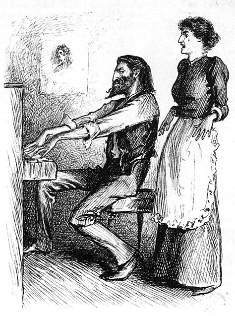
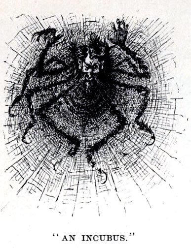
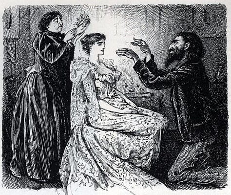
You can upload multiple images using the photo dropdown menu and clicking Gallery. (See the Trilby gallery at the beginning of this post.) Note that multiple images will put you near the email limit and you can’t resize it.
5. Precedence: images in serialized literature
Don’t think of using images the way marketers do. Images have appeared in novels nearly since the European novel’s humble beginnings. During the nineteenth century, the sister arts were all the rage.
The inclusion of pictures wasn’t a judgment call on readers’ intelligence; their presence made the reading public—from the upper class to the newly literate working class—clamor for those novels more. (They became so much a part of the reading culture that Jane Austen’s Pride and Prejudice, published in 1813 as a single volume without pictures, was reissued with illustrations in 1833.)
Pictures and text wouldn’t have become such close sisters during the nineteenth century had it not been for the technological advances that took place. “Illuminated” texts had been around for some time, but they were rare and expensive to produce on a mass scale. Books were typically illustrated with prints from wood engravings. The nineteenth century brought the advent of steel engravings; photography, which allowed the transfer of images from paper; color printing; and then the rotary and steam presses—all of which made illustrations easy and cheap to include.
Illustrations were always a seminal part of serial novels. Some drawings were decorative, but others depicted a scene, drew out characters, or presaged plot developments.
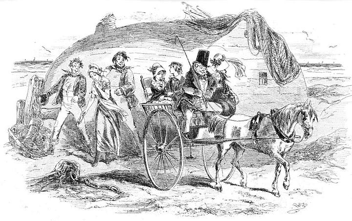
They didn’t start with Charles Dickens, but his The Posthumous Papers of the Pickwick Club is the most famous example. The story of the illustrations for Pickwick is a tragic and historic one. Dickens didn’t use Cruikshank again and instead tried another illustrator, the thirty-eight-year-old artist Robert Seymour. Seymour’s drawings didn’t satisfy Dickens, who replaced him with a second illustrator, Robert W. Buss. Seymour was devastated and ended his life by shooting himself in his garden. Dickens, always the perfectionist, didn’t like Buss’s work either and fired him too. Two illustrators applied for the job: William Makepeace Thackeray (yes, that Thackeray, author of Vanity Fair, which he’d illustrate himself, and just about a million other very long novels) and Hablot Knight Browne. Dickens chose Browne, and one of the greatest writer-illustrator relationships in literary history began.
Hablot Knight Browne, who took the nickname “Phiz,” was just twenty years old and Dickens, who’d been known as “Boz” for years, was only twenty-four when they teamed up. Phiz would go on to illustrate ten of Dickens’s full-length novels, including David Copperfield and (one of my favorites) Little Dorrit.
Phiz and many other early-nineteenth-century illustrators drew caricatures. Caricatures might best be seen as cartoonish, theatrical drawings. They were most often used satirically in magazines like the renowned Punch, but they suited serious works, too.
But readers’ tastes changed, and the second half of the nineteenth century brought realism. Often referred to as the “Golden Age” of illustration, classically trained artists came into fashion, including George Du Maurier and Dante Gabriel Rossetti.
The shift from caricature to realism was so great that some of Dickens’s novels were re-serialized and re-published with realistic drawings by artists, like Frederick Barnard, who was classically trained at the Royal Academy of London. Dickens was dead at that point; he never would have allowed it.


I wonder if literature would have lost its vast readership had we kept illustrations in all books. We can blame it on the arrival of radio, television, and the internet, but that doesn’t fully explain why only 22 percent of Americans read for pleasure. (In 1992, 61 percent said they did.) What if illustrations—as many fans of comics, graphic novels, and manga will attest—are integral to the reading experience?


I love you. Sorry, but it's true. Your delivery and information and heart are so good for me. Glad I discovered you! I will be booking an appointment, but want to make sure I have all my ducks in a row fro you to go over with me.
For me, illustration is a given! I have written several novels that have already gone through my writing group. I am wondering if there would be an audience for one of them in serial format on Substack because my genre is Middle Grade and my market is 9-10 year old boys. One novel is set in central Texas 13,000 years ago and another in the Front Range of northern Colorado, also 13,000 years ago. (Clovis culture). Would Substack serialization work for me? Maybe parents picking up on it? An agent? A publisher? I don’t really think that a 9-10 year old boy would find it by himself!